

In the present digital age, Android has become the soul part of the smartphones and its related products and services. Globally there are millions of Android users on various devices like mobile phones, smart TVs, watches, etc.
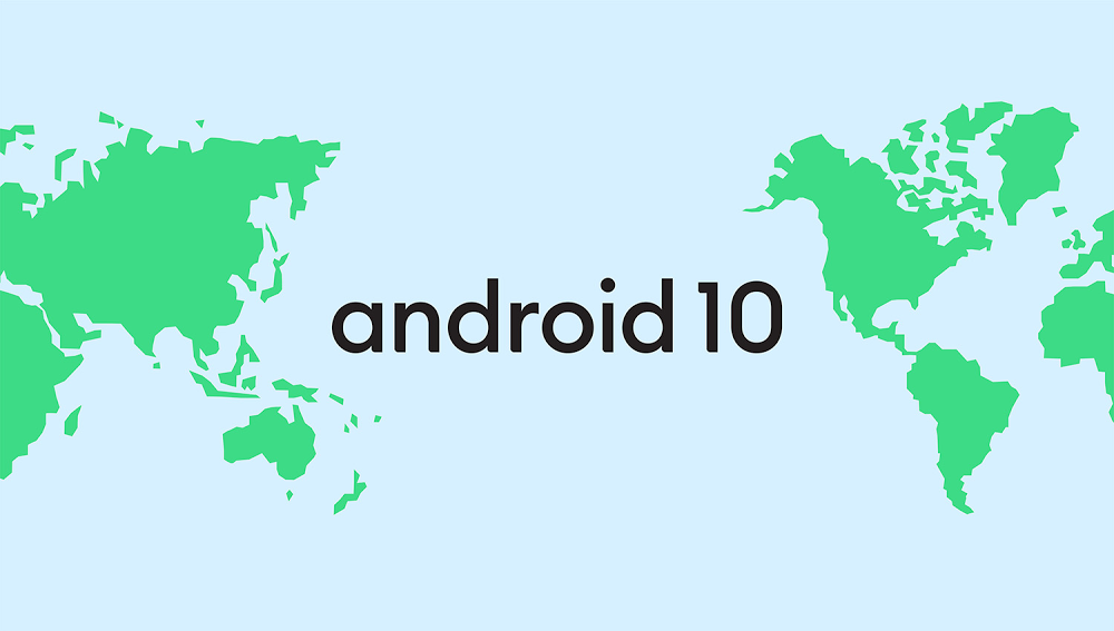
With constant efforts, Google always thrives to improve the user experience on Android. With this constant effort, Google has announced the Android 10 (Android Q)
This shook the world as they break the Consistency while giving their Android version… But it also sounds COOL.
Their development team always gave the name on tasty & mouth-watering desserts in the alphabetical sequences. This tradition has become the fun part in the in each release. Google mentioned they got the feedback that some name of the were unable to understand on the global level.
There are followings reasons why Google has broken its traditions.
1. The alphabet L & R are not distinguishable when spoken in other languages.
2. Most of the users get confused which is the latest Android version as an example Lollipop was the updated version after Kitkat. The users get confused about it.
3. At some portion of the globe, Pies is not a dessert while Mashmallow is not popular stuff at some portion.
4. The users does not have the clear idea that on which version their devices are operating.
Android is an open global operating system so it becomes essential to provide a clear name which should deliver the same meaning worldwide. So the Google adopts the simple version number this time i.e Android 10. There are no. of sweet and tempting “Q” names in desserts but this time these tech giants go for the simple number name.
New Branding With New Name
New branding for the new name definitely will make the refreshment among the Android users as well it developers. The Android brand has evolved in 2014 and this year again brand new logo, color is introduced with more modern and accessible appearance.
They moved logo from green to black as green was hard to read for visual impairment peoples as per the information obtained from Google. Hence this color improves the contrast and eliminates the errors.
As demonstrated by Google definitely, it’s a next revolution of the Android. This revolution will get live with the Android Q in the coming weeks.
Powered by DotnikStudio.com