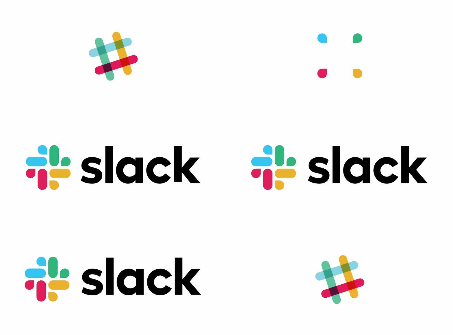
New year, New hope, New goals & Say hello to the Slack’s new Logo by Pentagram… The world’s most popular workplace chat platform has changed its logo and ready to brand with a totally new symbol.

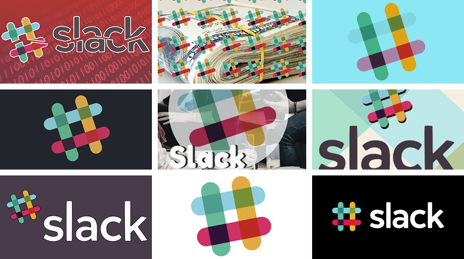
The old logo of the slack was created before its launch which consisted of pounds sign or hashtag sign. It contained the 11 different colors on white background tilted precisely at 18-degree rotation. Due to the presence of the 11 different colors, it appeared to be terrible when used for the branding on the different mediums, said by the Slack.

The new logo is developed by the Slack’s in-house design and brand team, together with Michael Bierut and the team from Pentagram, worked to create a new and more cohesive visual identity, so that it can be compensated and used effectively with a different purpose. The new logo has the more cohesive identity and created with the collaboration with Pentagram and rolled out with the new logo.

The new logo got the multiple reactions from the users, some say it appears like the swimming pool and for others, it denotes the replica of the swastika while someone said it represents like a squirting emoji.
Slack was very quick to roll down the new logo on the platforms like Android and Windows devices.

In the upcoming month, you will notice the other visual change in the slack in branding activities.
If you’d like to learn more about the design from Pentagram themselves, read their blog post here.


Thanks, it is very informative